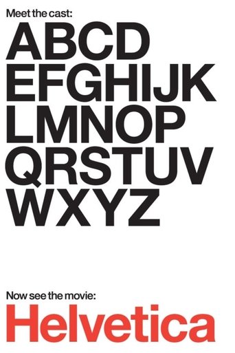
Helvetica
2007 · Film · documentary · 80 min
Part of Design Trilogy
Directed by Gary Hustwit
Helvetica is a feature-length independent film about typography, graphic design and global visual culture. It looks at the proliferation of one typeface (which will celebrate its 50th birthday in 2007) as part of a larger conversation about the way type affects our lives. The film is an exploration of urban spaces in major cities and the type that inhabits them, and a fluid discussion with renowned designers about their work, the creative process, and the choices and aesthetics behind their use of type.
61 positive3 negative1 mixed26 neutralfrom 91 commenters
Where to watch
No streaming data for this title.
96 comments on Hacker News
The general public was often using Times New Roman or whatever their system's default sans serif font was.
But, designers have cared about things like this for a very long time (ages, as you said.) Arial is joined at the hip with Helvetica, which got a movie[1] because of it's massive cultural impact and it's praise within design circles.
Among professional designers, there were very strong opinions on Helvetica and Arial--almost fever pitch at times. iirc, Arial exists do to the popularity of Helvetica and the background of this goes back to the 1950s. It wasn't just where it was placed in the font selection menu, it was given top billing in that menu deliberately (in Windows.) If you're interested, I think the Wikipedia page for Helvetica (Font)[2] covers it fairly deeply.
That all said, I haven't heard it hotly debated for some time now. The explosion of freely available fonts; popularity of new font families like Open Sans, Noto Sans, etc; and the ability to add custom fonts on the web seems to have slowly killed off the discourse in the last decade or so. I'm not in those design circles as often anymore, though.
[1] https://en.wikipedia.org/wiki/Helvetica_(film)
[2] https://en.wikipedia.org/wiki/Helvetica
The trilogy of design-related documentaries by Gary Hustwit! https://en.wikipedia.org/wiki/Design_Trilogy
1. Objectified (on the design of objects)
2. Helvetica (on the design of typefaces)
3. Urbanized (on the design of cities and urban spaces)
Pair this with:
https://en.wikipedia.org/wiki/Helvetica_(film)
(though it's marred by Arial being passed off for Helvetica in at least one showing)
About our "relationship with manufactured objects".
Gary Hustwit's next documentary after making Helvetica (2007).
If you're actually interested, I recommend watching Helvetica (2007). Some of the interviewees' enthusiasm is really contagious.
I was only able to find it available to watch through certain sites found through Yandex btw.
https://www.hustwit.com/helvetica
Love it. Passionate, well argued, aesthetic disagreements are just the best.
Reminds me of the documentary Helvetica [2007]. https://www.imdb.com/title/tt0847817/
Minor nit but I can't help notice it: the logo doesn't really match the product. Typography choices evoke certain feelings and attributes. Your choice to me says "beauty / personal hygiene", not "find whatever you want at your fingertips"
Short of hiring a designer (and also for fun), may I suggest watching the Helvetica film? https://vimeo.com/570441741
? Not only is there a very specific meaning to 'mathematical' the article is in fact dead-on example of good design rules.
'Mathematical' alignment would mean centering on the basis of width or height, whereaas 'optical' aligment would adjust for the 'visual weight' of the item, which often 'feels' different.
For example, a 100px wide container with a 50px wide image within it, may not be appropriate to sit at the 25px->75px range. It may need to be slightly adjusted depending on the visual mass of the images.
Honestly these are excellent rules for design, and it's a bit funny in fact to see all the comments from people unable to process ostensible ambiguity in the rules, as though they are looking for a 'precision algorithm'.
I would say to anyone having difficulty processing why these are helpful rules, that it would be worth looking into design principless overall, it'll be a fun experience.
The documentary 'Helvetica' is pretty fun.
The casually-made claim:
> "How can a human designer compete?"
and the (related, but as noted by @marc_io nearby, quite different) claim:
> "inevitable that this would impact on the demand for human artists, and I think this will start soon"
both need a more careful look.
Regarding the "designer" part -- most people aren't really very good at design and illustration, and adding computers doesn't always help. See, GeoCities home pages, or your favorite desktop publishing real estate agent ad.
People do get tired of sameness in images, and their eyes like new things, personal styles, clarity, chaos, whatever. That's one of the things designers do. See the Helvetica documentary for more [https://www.hustwit.com/helvetica].
Point of comparison: Geoff Hinton's careless claim, made in 2016, that radiologists would be displaced by 2021.
[https://towardsdatascience.com/why-ai-will-not-replace-radiologists-c7736f2c7d80]
[https://statmodeling.stat.columbia.edu/2021/06/07/ai-promised-to-revolutionize-radiology-but-so-far-its-failing/]
This tech will have an effect, but thinking that design (or, breathtakingly, "art"), is now a solved problem and we can move on, seems premature.
A re-watch of the Helvetica documentary might help here. Desktop publishing changed print design but high-impact print (or 2D) design is still very important and not left to amateurs, for good reasons.
Gary Hustwits design trilogy:
Helvetica - https://en.m.wikipedia.org/wiki/Helvetica_(film)
“about typography and graphic design, centered on the eponymous typeface.”
Objectified - https://en.m.wikipedia.org/wiki/Objectified
“examining the role of everyday non-living objects, and the people who design them, in our daily lives.”
Urbanized - https://en.m.wikipedia.org/wiki/Urbanized
“discusses how cities are designed, and it features interviews with urban planners and architects“
They are beautifully made films, and he interviews some of the most influential designers of the last century.
It funny how many times I’ve told people to watch Helvetica and they have just looked at me and asked how there could be a film about a “font”. It’s so much more, the films really cover design methodology and how it influences our every day lives.
I’ll scour my watch history, I’m pretty sure it was on Amazon Prime.
Meanwhile, if you think that sounds interesting I’d highly recommend the documentary Helvetica.
I think it’s Univers, designed by Swiss type designer Adrian Frutiger in the mid-50s. The lower-case ‘a’ was the first glyph I saw distinguishing it from Helvetica and Helvetica Neue, and the uppercase ‘R’ was the first I noticed distinguishing it from Helvetica Now, Arial and Frutiger.
There’s a zillion fonts that look like Helvetica/Univers/Akzidenz-Grotesk but most professional treatments will just use one of those and make sure it’s leaded, kerned, weighted and laid out properly. The Helvetica documentary is a fun watch that will also give a useful overview of these sorts of type families.
The differences are pretty subtle. Though the typeface is beautiful, a less skillful design would render it unremarkable. The typesetting and overall design— i.e. contrast, relationship among elements, controlling the path of the eye with visual hierarchy, etc.— is What makes the type really shine here. If you like this vibe, you might enjoy the posters of long-time MIT graphic designer Jacquelin Casey.
Don’t learn it if you don’t want to and don’t need to.
On the other hand, if you want a lighter introduction to design, try watching one of Gary Hustwit’s films like Helvetica, Objectified, or Rams. Or read the Design of Everyday Things by Don Norman.
While not really specifically about Bauhaus but covering the later movements it influenced up until the present, Gary Hustwit films in his "Design Trilogy" (Objectified, Helvetica, Urbanized) are a brilliant study into the influence of various design movements and designers over the last century. Very much recommend them:
https://en.wikipedia.org/wiki/Objectified
https://en.wikipedia.org/wiki/Helvetica_(film)
https://en.wikipedia.org/wiki/Urbanized
It’s not a talk, but you’ll learn a lot watching Gary Hustwit’s movie https://en.wikipedia.org/wiki/Helvetica_(film)
It’s much more than a history of the typeface. They walk through fashions and trends in design over the last half century, how that influences typography and vice versa. Most of the talking is by professional typographers and designers, so you get a lovely window into their trade. It’s one of my favorite documentaries.
You might get a lot out of the documentary Helvetica by Gary Hustwit
You’re right, my memory was wrong. It is a clone with the same metrics so layout wouldn’t change if you picked one versus the other. Microsoft paid monotype to port it to TrueType in 1990 which I believe was optimized for the screen. My memory of that is from the Helvetica documentary I watched maybe 10 years ago, so the specifics are hazy.
Early 2000s. Every myspace looks different. AIM profiles with colors, poems, quotes, and links. WinAmp skins, but also skins in desktops (WindowBlinds), wallpapers (DeviantArt), icons, ringtones, etc. To be cool, you'd make it yours. It all had a sort of gaudy messiness that never appealed to the artists and proto-hipsters, but they were the odd ones. And you could clearly tell what was business vs personal. Business was square and beige. Personal was colorful and round. It's all mixed together now. The moment when this flipped for me was the iPhone, because unlike Blackberry or Sidekick, this was a device that was meant for both work and play, and it pushed the design boundaries equally together. Facebook, Bootstrap, the death of RSS, the rise of streaming music services, etc. all happened around the same time. It felt fresh and modern! I remember. And it wasn't just surface-level design - the real change was in our personalities. Bring your whole self to work. Craft your personal brand. 10 more life hacks. Delete those facebook photos and that old blog. In 2020, hey now I even see your kitchen and your kids! There became no place to retreat to. Epitomized in any modern Apple ad. It elevated us, so we accepted it, but now deviate too far and mobs will attack you. Our age is an age of conformity. I'm reminded of a documentary called Helvetica from 2007. Has the world become less personalized? Even the word personalized doesn't quite capture what I wonder that was lost, because personalized would not be a word I'd have used then. What could cause this trend to reverse?
> I get that the author may just not like the format. They'd be bored by Jiro, they'd sleep during Helvetica, and they'd probably die watching Herzog movies. But they should acknowledge their biases rather than pretend they stumbled upon some shift in tv.
I think you're trying a bit too hard to dunk on the author. A lot of your conjecture here is somewhat unknowable, but I would assume the author of a book on minimalism would find something worthwhile in a documentary focusing on a typeface so closely associated with minimalist design.
This article says more about the author than about the series. They can't keep attention on what they're watching and think that silly tv series are a new thing.
Alternative take: Emily in Paris is a tv series where you shouldn't expect a lot of thinking, you'll find a new character introduced once in a while when you need new content, everything is obvious and striped to the core of the conveyed idea, and there are love stories and nice shots of France. That's it - you may enjoy it or not. If you get distracted with Instagram in the meantime, maybe you're just not that interested. The core is really not that different from Friends, for example. Or any of the 10+ season series. (I wouldn't go as far as the classic soaps - those had their own specific fake-dramatic style)
I get that the author may just not like the format. They'd be bored by Jiro, they'd sleep during Helvetica, and they'd probably die watching Herzog movies. But they should acknowledge their biases rather than pretend they stumbled upon some shift in tv.
(Ftr, I enjoyed Emily in Paris as silly entertainment, but I also find slow burn movies really fun. Jim Jarmusch makes me more engaged than most action movies)
Added: for the entertainment value, I'd pay to read their review of Twin Peaks...
Typography, and more broadly design, have a big impact on the way you perceive things. The rabbit hole is endless, but I recommend three entry points:
- The Design Trilogy of films, made up of Helvetica, Objectified, and Urbanized.
https://en.wikipedia.org/wiki/Design_Trilogy
- The book Universal Principles of Design by William Lidwell
- The 101 Things I Learned In... series. There isn't one for typography, unfortunately, but the Fashion, Urban Design, Architecture, and Product Design books cover similar territories.
The documentary "Helvetica" is worth watching if you're into typography: https://documentaryheaven.com/helvetica/
I recently watched the "Helvetica" documentary that was posted here a few days ago [0], where they briefly mention "Grunge Typography" [1], a seemingly dead-end branch of typography that, for some strange reason, became pretty popular for a short period of time.
After some years however, consensus amongst designers formed that what they've created was a pile of illegible garbage, and realized that there was no other way than completely dismiss that branch, go back to the roots, and evolve from a few steps back.
I feel the same kind of consensus is slowly forming around ideas like SPAs, client-side rendering and things like CSS-in-JS.
We saw the same happen with NoSQL and many other ideas before that.
We recently deployed an entire SaaS only using server-side rendering and htmx [2] to give it an SPA-like feel and immediate interactivity where needed. It was a pleasure to develop, it's snappy and we could actually rely on the Browser doing the heavy lifting for things like history, middle click, and not break stuff. I personally highly recommend it and see myself using this approach in many upcoming projects.
[0] https://www.hustwit.com/helvetica/
[1] https://www.theawl.com/2012/08/the-rise-and-fall-of-grunge-typography/
[2] https://htmx.org/ (formerly "Intercooler")
Timeless is just another word for "endlessly boring" which the movie isn't, but Helvetica is by now ;)
The director, Gary Hustwit, made his films (Helvetica, Objectified, Urbanized, Workplace, Rams, and others) available for free during the first weeks of the lockdown -- each one for a week. It was nice to see them again.
https://www.ohyouprettythings.com/free
I really enjoyed this film, but in telling the story of the cultural power and ubiquity of Helvetica, I think it dramatically underplays the fact that variations on Helvetica have been pre-installed on most modern personal computers by default.
From the about page [1]:
Gary Hustwit is an independent filmmaker and photographer based in New York....
In 2007 he made his directorial debut with Helvetica, the world’s first feature-length documentary about graphic design and typography. The film marked the beginning of a design film trilogy, with Objectified, about industrial design and product design following in 2009, and Urbanized, about the design of cities, in 2011. The films have been broadcast on PBS, BBC, HBO and television outlets in 20 countries, and have been screened in over 300 cities worldwide. Workplace, a documentary project about the future of the office, was commissioned for the 2016 Venice Biennale of Architecture. His most recent feature film, Rams, about German design legend Dieter Rams with original music by Brian Eno, was released in Fall 2018.
[1] https://www.hustwit.com/about
This is a great documentary. I watched it a long time ago, and it felt pretty timeless, just like Helvética itself.
I enjoyed learning the cultural context from which Helvetica emerged. In particular, I remember one man talking about how in the early 1900s, a company’s letterhead might have a floral font proclaiming The Inimitable Widgets, Gadgets, and Sprongdonacle Corporation of the Empire State. Then Helvetica comes along, and the company’s letterhead becomes Widgets Co. The same clean look mirrored in Mid-Century Modern and the Space Age.
I do wish the film had more details about the form of the font itself. E.g. explain the anatomy of a font, the choices made about the various parts, why subtle differences between Helvetica and Arial have significant impacts, etc. If anyone knows a good source of that kind of information, I would love to hear of it.
Very nice movie, recommend the full set, helvetica, objectified, urbanized, by the same director
I watched Helvetica since I am a strange person mesmerized by typefaces design. The lady in the film who claimed that Helvetica was responsible for the Vietnam War made me realize I am really not an insider with this crowd.
It’s very generous of Gary Hustwit to make his films free right now. He’s being doing one a week. I watched Rams last night and really enjoyed it. Dieter Rams lived in post-war Germany and pretty much invented modern product design. He was hugely influential to Jony Ive and Apple. If you like well-made documentaries about people fully engaged in their craft, I highly recommend it.
Also, check out Objectified which is more about product design in general and features Ives. Helvetica is my favorite Hustwit film, but this comes close if not surpasses it.
All they have to do is put the Helvetica documentary in and they'll make a fortune!
I joke, the whole thing of paying 100/mo for a cable provider versus 10/mo for Netflix is slowly catching up. I already have 4 subscriptions that are nearing to half the local cable offering (albeit Australia is chock full of ads), and more are coming?
It will be an interesting space to watch over the next few years.
> Traditional graphic design has largely been “solved” by the 1960’s - aka, the International style or the Swiss style for majority of needs. Of course you’re not gonna have Univers on a grunge band poster. For the curious, google some posters by Josef Muller-Brockmann from the 50’s - they still appear to be designed in 2019.
A documentary touching that subject is Helvetica [1]. It is about the Helvetica font.
[1] https://www.imdb.com/title/tt0847817/
Thanks for writing and updating such a great well researched article!
Funnily enough, the first sentence of the Wikipedia page about Interpress literally says: "Interpress is a page description language developed at Xerox PARC, based on the Forth programming language [1] and an earlier graphics language called JaM."
https://en.wikipedia.org/wiki/Interpress
The [1] reference is to: Harrington, Steven; Buckley, Robert R. (1988). Interpress, the Source Book. Brady Book. p. 18. ISBN 0-13-475591-X.
Unfortunately, I can't find a copy of it online (wouldn't it be deliciously ironic to find a PDF rendering of the Interpress Source Book? ;), so I can't check if the citation literally says Interpress was based on Forth, but I've asked Brian Reid if he had a copy or knew a better citation. I'll update the Wikipedia page if I get any more information.
I really love Brian's first-hand account of the origins of PostScript that he posted to laser-lovers!
If the Helvetica font can have a movie all about it, I think the story of PostScript deserves a whole miniseries! "showpage: the PostScript Documentary"
https://www.youtube.com/watch?v=wkoX0pEwSCw
Brian Reid is also known for Scribe, the Usenet Cookbook, and is well respected enough in computer security circles that Kevin Mitnick impersonated him on the phone to gain people's trust! ;)
https://en.wikipedia.org/wiki/Brian_Reid_(computer_scientist)
Brian's brother Glenn Reid was also very active in the PostScript world, he worked for Adobe (Illustrator), Apple (iMovie) and Fractal Design (Painter, Dabbler, Poser), and NeXT (Interpersonal Computing).
Around 1990, Glenn Reid independently designed and developed a delightfully original "Font Appreciation" app for NeXT called TouchType, which decades later only recently somehow found its way into Illustrator. Adobe even CALLED it the "Touch Type Tool", but didn't give him any credit or royalty. The only difference in Adobe's version of TouchType is that there's a space between "Touch" and "Type" (which TouchType made really easy to do), and that it came decades later!
Illustrator tutorial: Using the Touch Type tool | lynda.com: https://www.youtube.com/watch?v=WUkE3XLw_EA
SUMMARY OF BaNG MEETING #4, July 18, 1990: https://ftp.nice.ch/peanuts/GeneralData/Usenet/news/1990/_CSN-90/comp-sys-next/1990/Jul/_BaNG-%234-meeting-review.html
TOUCHTYPE Glenn Reid, Independent NeXT Developer
The next talk was given by Glenn Reid, who previously worked at both NeXT and Adobe. He demonstrated the use of his TouchType application, which should prove to be an enormous boon to people with serious typesetting needs.
TouchType is unlike any other text-manipulation program to date. It takes the traditional "draw program" metaphor used by programs like TopDraw and Adobe Illustrator and extends it to encompass selective editing of individual characters of a text object. To TouchType, text objects are not grouped as sequences of characters, but as individually movable letters. For instance, the "a" in "BaNG" can be moved independently of the rest of the word, yet TouchType still remembers that the "a" is associated with the other three letters.
Perhaps the best feature of this program is the ability to do very accurate and precise kerning (the ability to place characters closer together to create a more natural effect). TouchType supports intelligent automatic kerning and very intuitive, manual kerning done with a horizontal slider or by direct character manipulation. It also incorporates useful features such as sliders to change font sizes, character leading, and character widths, and an option which returns characters to a single base line.
TouchType, only six weeks in development, should be available in early August, with a tentative price of $249. BaNG members were given the opportunity to purchase the software for $150.
I mean if you watch the documentary Helvetica they do a pretty good job of explaining both the political statement the typeface was trying to make, the backlash against it as it was adopted/hijacked by corporations, and then the post-backlash period where we are now.
If you look at the new typeface it's clearly designed primarily for the needs of consumer products and advertising. They could have instead created a typeface that was purposely designed to look bad on consumer products and in advertising, but that's not the direction they went in. That's not an accident, it was a deliberate design decision.
Whereas the goal of the original typeface was to create a better society, the goal of the new one is basically to make it onto a Starbucks cup. It's not even a subtle difference, even though it's supposedly just an updated typeface the two are really night and day.
Helvetica’s relatively less popular but ubiquitous cousin, Univers also got a facelift in 2010 after 30 years before Adrian Frutiger passed away under the name “Univers Next” [1], the most prominent aspect of the redesign being the return of 16 degree italics blessed by Frutiger himself.
In my view, Univers evokes a deep feeling of sophistication unlike any other font. Helvetica has the “grunge” and New York aesthetic after it took over the graphic design scene in the 70’s and 80’s whereas Univers was silently used in engineering manuals, control panels, branding, keyboards(Apple), movie credits [2] and UI without much fuss. It never became cool and edgy as Helvetica, never tried to be something it is not and doesn't have a following. I was lucky enough to visit the archives [3] in a obscure drawer at the Museum fur Gestaltung in Zurich, seeing the original manuscripts of Univers was an extraordinary feeling. Created in 1950, it is truly timeless and sits along with other giants of contemporary typefaces such as Futura and Eurostile, perhaps in the back row towards the corner.
Univers was, is and always will be.
It’s my favorite font.
[1] https://www.myfonts.com/fonts/linotype/univers-next/
[2] https://www.dafont.com/forum/read/5633/what-s-the-font-for-movie-credits
[3] https://www.eguide.ch/en/designer/adrian-frutiger/
Thanks, I didn't know about that. Gary Hustwit is the same person that directed Helvetica, which is a classic design film IMO.
This happened in every other industry for very interesting but vague reasons, I suggest a lot of the same behaviour is at play in fashion.
See the great documentary 'Helvetica' [1] for an exploration of that issue. (I couldn't believe that I was going to watch a documentary about a font. But I did, and it changed my view of a lot of things)
[1] https://en.wikipedia.org/wiki/Helvetica_(film)
I do not think putting the brand on a textile has much relevance. I own designer pieces and they have little visible branding. Sure, engraving sans serif on a button is easier than serif, but if you have watched documentaries like Helvetica, the real reason is likely legibility.
I would say that Helvetica is most certainly a viable choice for design. Helvetica is great for when you want to present text that appears both modern yet extremely neutral. The MIT Technology [1] review uses a lot of Arial and Neue Haas Grotesk, which is the metal predecessor to Helvetica.
I may have some bias since I am a fan of the Helvetica documentary. Regardless of my preferences I think designers who reject Helvetica due to its popularity value originality more than practicality. In something like an art museum, or a fast food restaurant, originality is very important—people need to know what sets you apart from the rest! For something like code documentation or a technical manual, Helvetica is a great choice. When someone is reading my documentation, they have a very specific goal in mind, and the text I'm writing needs to serve a very explicit purpose. If the reader is thinking about anything that's not the literal contents of the text, there is room for improvement in the design of the content (IMO).
If you are intentional with your use of Helvetica, it can be a great choice. If it is obvious that you picked the default typeface, then your design will suffer.
1: https://www.technologyreview.com/
Well, Helvetica's been old-fashioned for well over 20 years, so it's not suprising that folks would have been over it for that long a time.
I remember watching the documentary of the same name, and wondering how everyone could be so fond of what's ultimately a very plain font. Now, Garamond or Bookman — those are fonts! All just a matter of taste, of course.
Link is to a trailer, not the actual film. The actual film is at https://shop.linotypefilm.com/ and is $20 for blu-ray or $8 on itunes or $8 on amazon video.
I loved the movie Helvetica, I'm sure I'll love Linotype!
Lol, I remember seeing the film "Helvetica" [1] in which one of the commenters remarked how anachronistic fonts would ruin a movie for him.
[1] www.imdb.com/title/tt0847817
At least Helvetica has a whole movie about it! [1]
"It's hard to evaluate it. It's like being asked what you think about off-white paint. It's just there. It's hard to get your head around something that's that big."
"And most people who use Helvetica use it because it's ubiquitious. It's like going to McDonalds instead of thinking about food. Because it's there. It's on every street corner. So let's eat crap, because it's on the corner."
[1] https://www.youtube.com/watch?v=7JkpYgjbYRg
If you haven't seen it, there's also a documentary (in English) called Helvetica that isn't about Frutiger but certainly gets into a lot of discussion about the international typographic style more broadly.
I really liked Zapf's work. Here's a clip from the documentary Helvetica https://www.youtube.com/watch?v=qjaepids2Q0
In some ways, the article reminds me of the documentary "Helvetica" about the eponymous font. In the film, font designers are both for and against, some calling it sterile and corporate/big-brother and others saying that it's about democratizing and humanizing fonts.
I'm gonna lean in favor of "this is the best outcome for everyone", even if it possibly screws specialized design roles (such as Icon creators). Google and Apples approach to design makes good sense (to me at least), as it significantly lowers the bar for what is needed to create a "good looking" app. Perhaps it's a more sterile look, but my apartment also has plain white walls for a reason.
> it's almost like all the characters look the same.
Interesting you say that, but prefer Helvetica. Quote from Erik Spiekermann in the film Helvetica: "Because all the letters...it's the whole Swiss ideology; the guy who designed it tried to make all the letters look the same."
Of course they aren't entirely subjective! There are objective ways that fonts can be assessed for sure. In fact, there's an entire documentary on Netflix about Helvetica (and titled the same).
The documentary 'Helvetica'[0] featured an interview with Massimo Vignelli. You can watch him talk about typography[1] and how he came to design his iconic 1972 New York City subway map[2].
[0] http://www.imdb.com/title/tt0847817/
[1] http://www.youtube.com/watch?v=El8jDI_ZuiI
[2] http://www.helveticafilm.com/vignellimap.html
To my knowledge the original Helvetica font was created by Max Miedinger (under supervision of his boss Eduard Hoffmann) at the Haas'sche Schriftgiesserei in the years 1956 and 1957 under the name "Neue Haas Grotesk". This font was already heavily influenced by Bertholds "Akzidenz Grotesk" (at my time of typesetting-apprenticeship, only professionals would be able to distinguish the two and my master always told me, the Helvetica would have been an effort to copy Akzidenz Grotesk for Linotype without paying license fees to Berthold. He was certainly wrong, but that was his perception). The company D. Stempel AG, co-owner of the Haas'sche Schriftgiesserei, produced the "Neue Haas Grotesk" for Linotype machines and re-labeled it into "Helvetica" for marketing purposes.
Many years ago I read a fascinating article (I believe from Eric Spiekerman), about the efforts to re-design the forms of the Deutsche Bundespost (German state mail service). In an analysis they found more than 600 variations of Helvetica in use within the organization before the relaunch.
The 1983 effort to design the "Neue Helvetica" (by Stempel, for Linotype) was certainly motivated by this defragmentation of Helvetica-variations, and it was sort of a last conservation before DTP would do all its damages to font identity and quality.
I am not sure what Mike Parkers role was in this process, but I would assume that he came into play after 1960 and that his role was more in the realization of Helvetica's impact and value for the graphical industry, rather than the original design. Which, in my eyes, sort of disqualifies him for the godfather-title. Nevertheless, I cry for all the big names in the typo-world, as one after another dies these days.
I have seen the Helvetica documentary, and I cried tears while watching, because I grew up with Helvetica as a reader and as a professional typesetter (typesetting was a 3-year apprenticeship in Germany around 1980). There is a big cultural thing about Helvetica, that cannot be expressed in words and that is not accessible to digital natives. There is only one true Helvetica face, and it has to be used and typesetted correctly, and in this combination it clearly stands out from everything else. For me, it is the one true font. You cannot fake it. You cannot (and should not) use it for every purpose. And the font has been misused, distorted, copied, derranged, overused and betrayed in every possible way - to the degree that noone can stand it anymore.
But try to find some airplane security card from German Lufthansa from the year 1982 and you will understand, how Helvetica can be used to build trust and confidence in airflight passengers!
The Helvetica documentary was quite good in giving a vague feeling, what cultural impact can be coded in the history of one single typeface! These days are gone, though, and I feel woe and grief with the decline of cultural typographical awareness and the loss of people like Mike Parker.
The impact of Helvetica is quite significant, there even is a documentary about it, called Helvetica! check it out its really great. (It includes an interview with Mike Parker)
http://www.imdb.com/title/tt0847817/reference
It seems that I'm too tired to use my phone to type anything correctly. The documentary "Helvetica" is on Netflix. :)
Might have meant to say documentary. There is one about Helvetica, named so.
Watch the documentary. Helvetica is like air, or water. It's the font when you choose don't want to choose a font, because It says absolutely nothing.
Feel free to skip this movie. It's mostly old white dudes gushing about how great helvetica is.
There's a documentary about Helvetica that's available on Netflix (US).
http://en.wikipedia.org/wiki/Helvetica_(film)
Not a designer here, but this comment reminded me of the movie "Helvetica", which describes the same pendulum effect happening in font design over the years. Couldn't agree more that a swing the other way would be a great development.
It's always a combination of universality and exclusivity. The latter creates a "gradient" which causes a particular design to spread. Watch the documentary "Helvetica". At it's peak in the 1960s, Helvetica had high-end "international" aura and small brands everywhere were scrambling to redesign their signage to what they perceived was a new customer-friendly yet high-end image (probably best visualized as a smiling and good-looking Swiss airline flight attendant with a noticeable accent).
It's a great documentary, certainly one I'd recommend to everyone here. If you haven't seen them already, I highly recommend Helvetica and Urbanized.
An interesting documentary: "Helvetica" (free on amazon prime) http://www.amazon.com/Helvetica/dp/B002RIOGI0/ref=sr_1_1?ie=UTF8&qid=1359177578&sr=8-1&keywords=helvetica
I got one wrong. I attribute that not to my genius but to having seen the excellent documentary "Helvetica".
Turns out that's an excellent home date movie.
Yeah, going into it I didn't know much about the differences between the fonts but was curious anyway. After getting a few wrong I switched to choosing which ones I thought looked nicer and started getting Helvetica more times. That reminds me I need to finish watching the Helvetica documentary.
I got through about 15 questions, had flash backs to the documentary "Helvetica" where it's just never ending stream of examples for 1 1/2 hours and couldn't take anymore. I'll take your word for it.
Fun test. Also if anyone's interested in Helvetica or typesetting in general just watched a pretty good documentary recently that got me more interested in the topic: http://www.helveticafilm.com/, also available on netflix: https://movies.netflix.com/WiMovie/Helvetica/70076125
Sorta similar to the 'Objectified' doc that was recommended by HackDesign but I actually liked this one better.
Tip: make your lesson 1 a "free demo" or something if you want to get more people interested! (the only reason I didn't say "fuck this" and moved on after amazon said it won't stream the video to me because I'm not in the US was because I happened to remember the Helvetica documentary and thought maybe it's worth the pain...)
For those interested in typography, while I found blog posts helpful in teaching myself, if you really want to understand, I recommend reading one of the canonical texts depending on your particular interest. Typography is a deep field with a lot to know before you can really know what you're doing.
The Elements of Typographical Style is a beautiful book and an elegant, literary introduction and guide: http://www.amazon.com/gp/product/0881792063/ref=as_li_qf_sp_asin_tl?ie=UTF8&camp=1789&creative=9325&creativeASIN=0881792063&linkCode=as2&tag=morgasuthe-20
Thinking with Type is full of contemporary examples to give you new ideas: http://www.amazon.com/gp/product/1568989695/ref=as_li_qf_sp_asin_tl?ie=UTF8&camp=1789&creative=9325&creativeASIN=1568989695&linkCode=as2&tag=morgasuthe-20
Ruder's Typographie is the book that established modern typography and is the de fact guide to modernist typography: http://www.amazon.com/gp/product/3721200438/ref=as_li_qf_sp_asin_il_tl?ie=UTF8&camp=1789&creative=9325&creativeASIN=3721200438&linkCode=as2&tag=morgasuthe-20
As an introduction to typography, I also recommend watching Helvetica: http://www.amazon.com/gp/product/B002RIOGI0/ref=as_li_qf_sp_asin_il_tl?ie=UTF8&camp=1789&creative=9325&creativeASIN=B002RIOGI0&linkCode=as2&tag=morgasuthe-20 – it will give you a personal perspective on different philosophies of choice of type-face
For that matter, the same goes for color theory.
Here's a nice introduction to color in general from the Adobe website: http://www.adobe.com/products/adobemag/archive/pdfs/9611febf.pdf
The Wikipedia entry is worth reading: http://en.wikipedia.org/wiki/Color
Kandinsky's Concerning the Spiritual in Art is a beautiful manifesto on art, but contains a very interesting theory of color: http://www.amazon.com/gp/product/1619491532/ref=as_li_qf_sp_asin_il_tl?ie=UTF8&camp=1789&creative=9325&creativeASIN=1619491532&linkCode=as2&tag=morgasuthe-20
Itten's The Elements of Color is the classic text on color: http://www.amazon.com/gp/product/0471289299/ref=as_li_qf_sp_asin_il_tl?ie=UTF8&camp=1789&creative=9325&creativeASIN=0471289299&linkCode=as2&tag=morgasuthe-20
Albers' Interaction of Color will teach you that colors are no absolute reference ponts – they interact with each other to create all sorts of effects (this text pairs well with the Kandinsky): http://www.amazon.com/gp/product/0300018460/ref=as_li_qf_sp_asin_il_tl?ie=UTF8&camp=1789&creative=9325&creativeASIN=0300018460&linkCode=as2&tag=morgasuthe-20
To get really deep into color, check out the IESNA handbook: http://www.ies.org/handbook/
All this is not to obviate OP's impetus to write posts on these topics. Blog posts are crucial as introductions and I find tend to work better as references than books, which tend to be overwhelming and ignored in this digital age. But if you want to go deeper, these are my favorite references after moderately exhaustive research.
An alternative approach:
– Start by reading "Magic Ink" by Bret Victor: http://worrydream.com/#!/MagicInk
– Now you understand that UI design is actually graphic design, so start with graphic design fundamentals. They are: Drawing, Layout, Typography, Color, History.
– Drawing: understand how images are created on a canvas. Includes concepts of how to use line, shade, and color to create forms, volumes, depth, etc. Art historians talk about "color and line" in painting. Understand the distinction. Pick up a used copy of Janson's History of Art. Peruse some other books about drawing. Go to the museum. Whatever you come across. Have fun with it.
– Layout: I haven't found a great resource for this. You can have a look at Grid Systems by Josef Müller-Brockman, which set the tone for layout in the 20th century. Making and Breaking the Grid is a modern spin on grid-based layout. Read about book design since that's the oldest and most developed layout system. You can start with Wikipedia: http://en.wikipedia.org/wiki/Book_design. Generally pay attention to how websites are arranged. Is there a top-bar or a side-bar? How many sections of content are there? What is their relative proportion? How does the layout relate to the borders of the browser window? Take some time to investigate 'responsive design'. Understand what it means to design from the content out rather than from the edges in. Understand the fact that book design has a rich set of systems of proportion while web designers completely ignore this for the most part. Look up 'golden ratio typography'.
– Typography: there are a number of well-regarded classics on typography. The Elements of Typographic Style is great. But you should start with this: http://webtypography.net/. Then check out the Wikipedia entry and Google around for blog posts about typography. Once you understand the basics, then attempt an in-depth text. The most important thing to understand is that typography can be used to create structure. People who do not understand this use lines, planes, and volumes to create structure around content. A good place to learn about this is in Edward Tufte's The Visual Display of Quantitative Information (as well as its sequels). He vigorously recommends removing as much "non-data ink" as possible. Beyond structure, there is the issue of choosing typefaces. Let me just get this one out of the way: serif faces are not significantly easier to read than sans-serif faces. Beyond that, understand that typefaces are created by designers for different uses. Use typefaces according to what they're designed for. Understand how typefaces are used to create a stylistic feel, to evoke associations, nostalgia, emotion. Understand that some typefaces are expressive and some are not. The web so far has favored non-expressive typefaces. Now that we have @font-face and Google Fonts, people are going crazy using different type-faces will-nilly. Web design will evolve. Watch the documentary "Helvetica".
– Color: there are many resources on color, but the study of color is an endeavor that can last a lifetime. There are a few things to understand about color: what it is (light frequency / a sensation), how it is modelled (Newton vs. Goethe, HSL/RGB, color spaces, Pantone), how it is created, how colors are combined, the fundamental nature of each hue, and psychological meaning of color combinations. Start with the Wikipedia entry. For more scientific information, check out the IESNA handbook. Understand the difference between Newton's and Goethe's studies of color and how current theories descend from those. After them came Maxwell, Helmholtz, and others. Munsell's text is responsible for much of the exploration of color in early modernist painting (impressionism, etc.): http://www.gutenberg.org/files/26054/26054-h/26054-h.htm. Study color combining by way of texts from the early 20th century by Albers, Itten, etc. But, as others have mentioned, the only way to truly understand color is to use it. Try different combinations, see what they do. Ask questions like: why are most websites blue? Why aren't websites ever yellow? Beyond cultural associations, each color has a fundamentally different nature and use. It's not just a spectrum. Why is red so special? Notice that blue and yellow are, in Goethe's theory, the fundamental colors from which all colors are created. Does this have something to do with their neutrality? The sun is yellow, the sky is blue, the ocean is blue... what does it all mean? Why are the road signs green?
– History: web design didn't just come out of nowhere, though most web designers are uneducated and the tools have been very primitive up until the last few years, so it kind of seems that way. Find a copy of Meggs' History of Design. Understand what it is, where it comes from, how book design is the father of graphic design. Then, something crucial to understand: that web design is constrained by the concepts of the past, which were developed in a world with different constraints. Do you know how graphics were created before computers?
Unfortunately there is no good book that gives an overview of all of this material. You need to piece it together. Here's a screenshot of my library of design books: http://img823.imageshack.us/img823/7795/screenshot20120731at120.png. Plus you should have a library of design inspiration. I have mine spread out between LittleSnapper and ZooTool right now. Evernote is another good way if you can stand all the visual noise in their interface. Other people use Pinterest, etc.
What you should take away from this is that UI design is actually part of graphic design, which is a relatively old discipline (though still young compared to, say, architecture).
On the other hand it can be said that UI/UX rather encompasses graphic design since UX brings in the notion of user-centered design from HCI, which has its own history in psychology and the US military industrial complex. Two great historical reads here are MIL STD 1472F: http://www.hf.faa.gov/docs/508/docs/milstd14.pdf and The Ecological Approach to Visual Perception by J.J. Gibson (from whence the concept of "affordance" comes). The classic synthesis of these ideas can be found in The Design of Everyday Things by Donald Norman. Bill Buxton is another person to follow in this space. A modern synthesis of UX is About Face 3: The Essentials of Interaction Design.
EDIT: fixed links
The genius of Helvetica is that it's styled, but subtle. It "gets out of the way," but not entirely. The common assertion about Helvetica is that it's "clean" and unstylized. But actually, its cleanliness comes from the assertion of a certain style.
On a semi-related note, I highly recommend the documentary "Helvetica," as well as the books about the development of the font. I'm not a font wonk by any means, but I do enjoy design. Anyone with even a passing interest in the subject will get a kick out of the film.
If you're genuinely interested, I'd suggest you check out the movie Helvetica.
Fonts often take thousands of man-hours to complete, and faces with extended characters are much more involved.
What this designer might lack in business chops he makes up in generousity. How many competent designers are willing to do something for $25k a year?
If you like that, the same group made another documentary called 'Helvetica' that is all about fonts and, specifically, about the history and ubiquity of Helvetica. It's also available on Netflix-instant and is a pretty good watch:
http://en.wikipedia.org/wiki/Helvetica_(film)
I might just be a little slow this morning, but it took me a good minute to figure out where the content was: it's an audio interview. Hit play on the left.
Also, go watch the movie Helvetica, if you haven't already.
I quite like that director's previous documentary: Helvetica (http://www.helveticafilm.com/)
Helvetica http://www.imdb.com/title/tt0847817/
Helvetica was really a fantastic film. If anyone is in the mood for an informative documentary, I would recommend it.
Make that two: Verdana. Both designed by Matthew Carter. You may remember him from the hit film, Helvetica.
Not entirely on-point, but there's a remarkably fascinating documentary I watched on Netflix one night called "Helvetica." Check it out.
Art & Copy - similar to Helvetica and Objectified. Good documentary about advertising and design's power, effect, and influence.
Not everybody loves Helvetica. It's pretty boring, seriously overused, and in its own way tacky. That said, it has historical value. Watch the movie Helvetica for more details, but the short of it is that it was introduced during that time the author speaks of where people were just starting to see the potential of graphic design. You'd hire a fancy new designer to come in and revitalize your company's letterhead and they'd present you with a blank, brilliantly white sheet of paper with your company's name in Helvetica. It was stark, amazing, totally lifeless, but just so New it was easy to buy in.
Then add in that for all Helvetica's faults, it is amazingly versatile and readable. It is absolutely well designed for it's somewhat sterile purposes and therefore easy to paste up everywhere. Couple that with an air of Newness and, ironically, personalization of hiring your own print designer and next thing you know it's everywhere wnd beloved.
There's a lot more to the story, of course, but it all turns to the historical value of Helvetica being the font that a new wave of popular design championed. It was there when people wanted and needed it.
(It's also worth mentioning it's Swiss heritage and how often the relatively unique Swiss design aesthetic gets conflated with cries for simplicity, modernity, and "clean". All deserved, sure, but they certainly understate the contribution of valuing space and openness that seems to be the heart of that movement, to me. I've often heard that their design is inspired by the openness of the Swiss landscapes. Unique, beautiful, but hardly the Final Word in design aesthetics.)
> After a much-needed break, a drawing was held. Some of the winners got a DVD called "Helvetica," a 2007 documentary about typography.
This one really cracked me up.
Also you can say both in same variation of Helvetica, it will feel the same because Helvetica is neutral.
And that's what Vignelli meant in the film.
The guy who made it, Gary Hustwit, also made one called Helvetica, which is very very good, and is making a third (and final in the "series") called Urbanized, about urban design:
http://www.objectifiedfilm.com/blog/the-next-film-urbanized/
Also, Objectified is on Netflix streaming now, I believe.
The documentary, Helvetica, is worth watching to see various typeface designers' love/hate for the severity of the minimalism implicated by Bauhaus.
Awesome. A coworker was walking by just now and he couldn't believe so much thought could go into typography. Or that there's an entire movie about Helvetica.
The documentary Helvetica was made by the same director, http://en.wikipedia.org/wiki/Helvetica_%28film%29. I was impressed that a documentary about fonts could be so engaging.
Any one interested in typography, a good documentary to watch is Helvetica.
Snowboarding, hiking, cycling, basement dance parties, photography, making random videos, this american life on NPR, watching geeked out documentaries like helvetica, and getting up on my wife... not necessarily in that order. Oh, and eating, I love eating.
By total coincidence I watched that movie yesterday. I enjoyed it, though it's mostly just a bunch of people's opinion about Helvetica/modernism/post-modernism. Doesn't good much deeper than that in typeface design.
Can't remember where I heard about it (possibly MetaFilter, or here?).
Strange timing. Yesterday I watched the documentary "Helvetica" (2007) which is all about typefaces:
http://www.imdb.com/title/tt0847817/
http://www.helveticafilm.com/
About the film: Helvetica is a feature-length independent film about typography, graphic design and global visual culture. It looks at the proliferation of one typeface (which celebrated its 50th birthday in 2007) as part of a larger conversation about the way type affects our lives. The film is an exploration of urban spaces in major cities and the type that inhabits them, and a fluid discussion with renowned designers about their work, the creative process, and the choices and aesthetics behind their use of type.
I'm not a typography geek (or even a designer), but I'm fascinated with how passionate people can be about typefaces. The documentary mentioned in the article, Helvetica, blew my mind, mostly because of the passion/conflict/opinion that people have about something I take wholly for granted.
http://www.helveticafilm.com/
Warning: watching this movie may have self-image ramifications such as "Wow, did I just watch a documentary about a font?" :)
I think it's part of an evolution. Some web-designers are discovering the (long established in traditional printing) grid systems but not all of them really know how to use it or really what to do with it, besides the fact that it's a tool that they should probably use. They end up using it more prominently than they should because it's new to them.
To me, it feels like it's the result of learning the domain backwards, where you have a finished product and then learn about how it's usually done, so you correct here and there some aspects. And it shows.
To be honest, I'm saying that without knowing either how to properly use grids. As many others, I have seen many descriptions of it and how, for some designers, it's the ultimate thing and for others, a tool that they don't want to stick to (e.g. as presented in the documentary Helvetica.)
In the end, do you feel that it's better or worse that people with no "proper" design background apply the grid systems "too much" rather than not paying attention to it at all? I believe that it's good that that kind of knowledge gets spread out, even it misused at first.
Hehehehe.
I saw the movie, Helvetica, recently. It was astonishing to see people's vehement opposition to (no, hatred of) a typeface. (http://www.imdb.com/title/tt0847817/)
Fantastic link. I'm a New Yorker, I find the city's history fascinating, and I loved the documentary "Helvetica."
If you have the slightest interest in design or typography, go check out "Helvetica." I never realized how common Helvetica really is -- like one of the designers says, it's like air. Plus, the movie has a great soundtrack by El Ten Eleven.
I want to see a documentary on this! Why not right? they already have on out for the font Helvetica.